Wednesday, April 4, 2012

Finally, a new Skype™ feature I can get behind

I've always been a big fan of Skype's because it's free VOIP (Voice Over Internet Protocol) and features a decent call test function, but I've always been a big enemy of Skype's because:

  • Skype features as few 'quit' buttons as possible
  • Skype puts its 'quit' buttons in only the least convenient, most clicks-per-task locations
  • Skype insinuates itself into your boot at install without asking
  • Skype minimizes and x's hidden to the tray by default and has no config of its own to change the behavior
  • Skype takes over control of audio hardware, dimming other sounds, overriding Windows settings, without asking
  • Skype installs its browser bars without asking and sometimes again on update
  • Skype's incoming call button uses "always-on-top" when your focus is elsewhere, but doesn't give the button focus when you are already in the software
  • Skype's splash doesn't contain settings for status (away, invisible) before log in
  • Skype hides messages behind a bunch of blue space that's not doing anything until you click a little orange ball up by someone's name which may or may not be on screen during a call
  • Skype has no volume control anywhere on the main call screen
  • Skype's pop-up ads feature just-kidding-x-buttons so you can close them so they can come right back
  • Skype thinks your PC is its playground and doesn't care what else you do with it or whether you mind
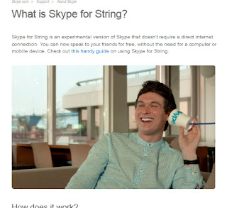
Skype™ without all that PC hardwareBut earlier this week Skype announced its new service Skype™ for String, and I'd like to say, Skype, this is the best thing you've done since you added a 'quit' button back to the task bar right-click options.

 Learn more about the new tech here:
Skype™ for String

Monday, October 10, 2011

Mac Corner: They see me scrollin... they hatin...

The release of Apple OSX 10.7 "Lion" brought with it many drastic changes to the way the operating system works. Native applications now have better gesture integration, autosaving "versions" of many documents, and a complete redesign of most power user features ("Spaces" is now "Mission Control", etc.) While new features always come with pros and cons, the most egregious change is what happened to scrolling.

For the few PC users that are not aware of my Mac woes, after installing the OS, I found that scroll gestures were, by default, inverted. Horizontal gestures felt natural, but vertical scrolling was backwards from what it's been since mouses have had the scroll wheel metaphor (pull back on the wheel, and content is pushed upward as if it were rubbing against the bottom of the wheel.) Some computer mice, like my logitech, also had the ability to lean horizontally, to accommodate horizontal scrolling as well. Push the top of the wheel right to scroll to the right, and vice versa.

In Lion, these metaphors were abandoned in favor of trackpad metaphors: push the content in the direction you want it to go. The new metaphor conflicted with the 2-finger virtual-mousewheel scrolling to which everyone was accustomed, as well as the mousewheel "lean." The change may have meant to make the operating system more friendly to the "iPad as first computer ever" demographic, but what isn't clear is why I can't change it back.

In System Preferences, there is an option to turn off "natural" scroll direction. Unfortunately, this just inverts ALL gestures. Apple has made me choose: Learn an unnatural horizontal gesture, or unlearn your natural vertical gestures. Meanwhile, they've branded the wiring in my own head unnatural. Considering that the use of gestures on a laptop is already the domain of "power users," it seems ludicrous that the power to tweak the settings appropriately isn't built into preferences like it is in say, "Hot Corners" or F-key Options.

You might be thinking at this point, "What's the big deal? Why not just teach yourself the new paradigm and stop whining."

I wish it were that simple.

I did learn inverted vertical scrolling. In the OS. In Web browsers. And in every bloody game I've ever played on my Mac, including games like Minecraft where the vertical scroll wheel was already a flimsy metaphor for navigating a horizontal item bar. The real problem is having to unlearn my new skills every time I jump onto a school or work computer that isn't running Lion, or when I find myself using a PC. It's like being forced to use my non-dominant hand to brush my teeth. It isn't natural, there's no inherent benefit, and it probably takes me twice as long to do a good job. Or in the case of an FPS, I take out the handgun when I meant to pull out a shotgun, and that split second mistake meant the difference between glorious victory and a face full of bullets.

Thanks for ruining my killstreak.
Wednesday, October 5, 2011

Inline images with GMail

Sure, blogger has a handy little 'insert image' icon, but why don't I see that button in GMail?  Of course you can always insert an image with the link button, by using a URL that links to it, but that's assuming you have the image in question hosted online.

For uploading snapshots and other images from your local machine, you'll need to enable GoogleLabs 'Insert Image'.
  1. In GMail, look to the upper right corner of the page and find this little gear (Options).  Click it, and choose 'Mail settings' as opposed to 'Mail Help'.
  2. You'll be under the 'General' tab, which is cool, but check it out later.  Skip over to the 'Labs' tab and click that.
  3. You can use the search bar, or your knowledge of the English alphabet.  Either way, you're looking for 'Inserting Images' by Kent T.  Click the 'Enable' button.
  4. That's it!  There are really only 3 steps.  The 'insert images'  button will show up in between the 'insert emoticon' & 'link' buttons.

Wednesday, September 7, 2011

Anti-virus, no excuse to go without

Windows may come with its own (decent) firewall and malware detector (Defender), but you're not safe unless you a)never go online, b)employ up-to-date anti-virus. For my own Windows 7 pcs, I've had great results and minimal bother from ESET NOD32 for Anti-virus & the ESET Smart Security for its firewall.

I chose ESET because it has a pretty small memory footprint, allowing me to get the most out of my machine, specifically because ESET knows when I'm gaming and tries not to bother me. There are a lot of other things to consider when you choose anti-virus, however, not the least of which is price.

AVG free and Avast are two of the highest rated free anti-virus programs out there, so if you're on a budget, or you need a subscription for that laptop/old/backup PC you bust out every once in a while, consider these.

I could rave about ESET and rant about McAfee all day, but I'd like to highlight a website I've found in my search for the perfect AV software. AV-Comparatives is "an Austrian Non-Profit-Organization, which is providing independent Anti-Virus software tests free to the public." Don't let the broken English scare you away; They've got PDF reports on detection rates, false positives, performance statistics, etc, written concisely with explanations for laymen along the way.

If you were thinking about only going to the internet's most visited sites and hoping to come out unscathed, remember that Facebook messages, YouTube comments, and certainly Yahoo emails can all contain malware, trackers, and viruses. If budget is the issue, check out AVGFree and Avast. If indecision is your issue, spend a few minutes on AV-Comparatives. Whatever you do, don't go without!

Wednesday, June 29, 2011

Firefox 5.0 Excellent 5.0 totally best!


Put the phrase 'awesome bar' into your favorite search best-ever engine to find out more!
Firefox has delivered straight-forward extensibility and efficient performance in its various iterations. This new release landing page drivel about an awesome bar is not what a Firefox user wants to be looking at. A feature highlight that is
a)old news
b)uninformative
is not the Firefox I'm used to and it's not awesome.

Thursday, June 16, 2011

Help systray help you

The windows taskbar has changed a lot over the years, and more so the start menu, but ever since Windows 95 brought me the System Tray, I've been glancing at the bottom right corner of my screen to see what's running.

Back in those days, if you closed a window, you closed the program.  Even the most ignorant user today probably knows that's not always the case anymore, but on the flip side, even the most savvy user is fighting a constant battle against monopoware that thinks it really ought to be running all the time.  A good interface includes the option to close, minimize, or minimize to system tray (notification area) when you hit the x.  Winamp and even (monopoware) iTunes are a couple of examples.  It's a great place for stuff that you like to keep running in the not-quite-background; you get more space for your foreground stuff in the taskbar.  It's not there to be a place for Skype and Steam to hide when you think you've closed them, though.  Or maybe you just don't care and you want to hide them all...

To the point:  Windows 7's system tray has that little arrow on the left side of the icons.  Click it and you'll find all those always-on programs, hit customize and you can set their behaviors.

An example of each of the three settings.

Now I know when Steam and Soluto are running on their own (the worst of these wares like iTunes and Skype will even reset this after some updates).  Now my antivirus and Windows update won't take up space on the bar unless I need to know something.

Monday, June 6, 2011

CDisplay: lighter & easier than paper & ink

If you've got any .cbr/.cbz files on your drive, then you've probably already got a viewer you like.  I've yet to find a bad one, but on the off-chance that your viewer could do more (less?) for you, I'd like to introduce & recommend CDisplay.

CDisplay is a free sequential image viewer.  The application is small and the phrase "easy to use" makes it sound more complicated than it is.  The blank screen you get when you run CDisplay is accompanied by a little tool-tip that tells you everything you need to know to get started.  Everything great about CDisplay is at your fingertips when you right-click, including CDisplay's "Load Next File" (Shift+L) for when you want to go seamlessly from issue 12 to 13.

Before you do anything, hit C for config.  Mouse Control options are presented with a function drop down for each type of mouse button use: single-left click to triple middle-click, which makes a lot more sense to me than vice versa.  The Image Sizing options are pretty comprehensive; On my laptop I use "fit width if oversized" and "suppress for double pages," while on my desktop I also use "fit height" to avoid scrolling.  Finally, program settings include "Japanese mode" (ctrl+J) for manga display.

It's true, there's nothing mindblowing about these features when you compare CDisplay to Comical or iOS Comixology, but accessing and using the customization features of CDisplay is one of the most straight-forward, no-nonsense experiences you can have on a PC today, and with such great focus on allowing you to set the controls that feel natural to you, I promise you'll only configure CDisplay ONCE.

CDisplay, like most if not all of its competition, allows for multiple favorite directories (rather than restrictive single-location libraries a la iTunes), and bookmarks, but this is one of those rare times where non-invasive usage-assumptions really shine: 

Open up CDisplay
Hit R
Resume reading right where you left off.

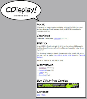
The whole website.  Note the lack of Comic Sans.
CDisplay's website is another breath of fresh-air.  None of the bloat of sites for wares that exist as platforms for file-pull sales.  Instead? A link.  Maybe you went to get CDisplay and found it wasn't for you (or your OS).  Links to alternative viewers.  These links even include CDisplayEx, which covers more formats than just rar- & zip-based formats .cbr & .cbz as well as a handful of other languages. 

CDisplay isn't great because of what it can do.  It's great because of how it does it.  Setup & config are quick and powerful, and CDisplay's tool-tips and lack of chrome are respectful and refreshing.